Building a Finance Dashboard with TailwindCSS 2.0 and Alpine.js
2 December 2020
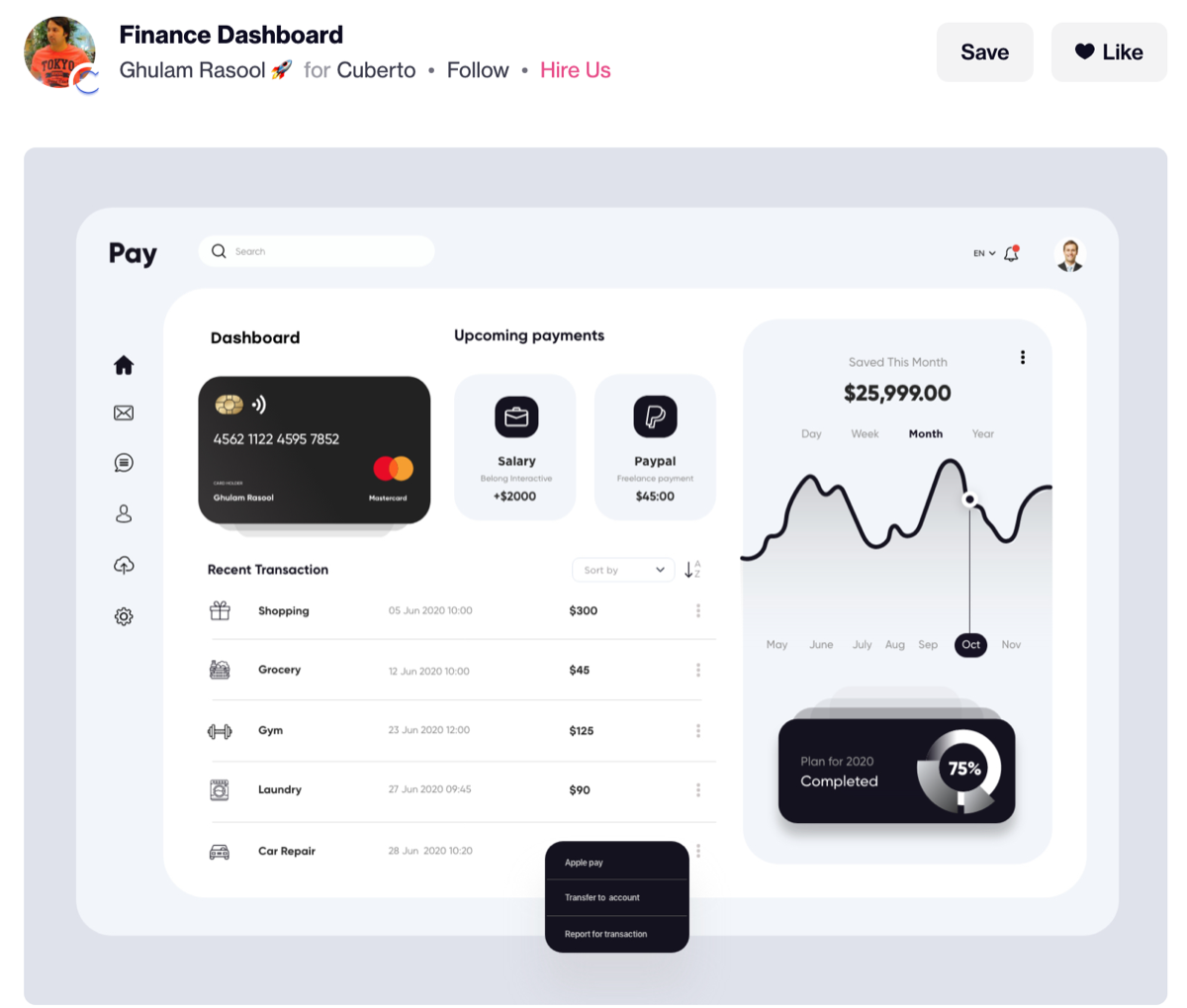
Tailwind 2.0 had just released and I wanted to try out the new features without risking an existing project. I found a Dribbble shot by Ghulam Rasool and built it out, adding Alpine.js for interactivity.

The original design was desktop-only, so I adapted mobile and tablet layouts from similar work on the creator’s profile. The live version is on GitHub Pages, linked above.
CSS Grid

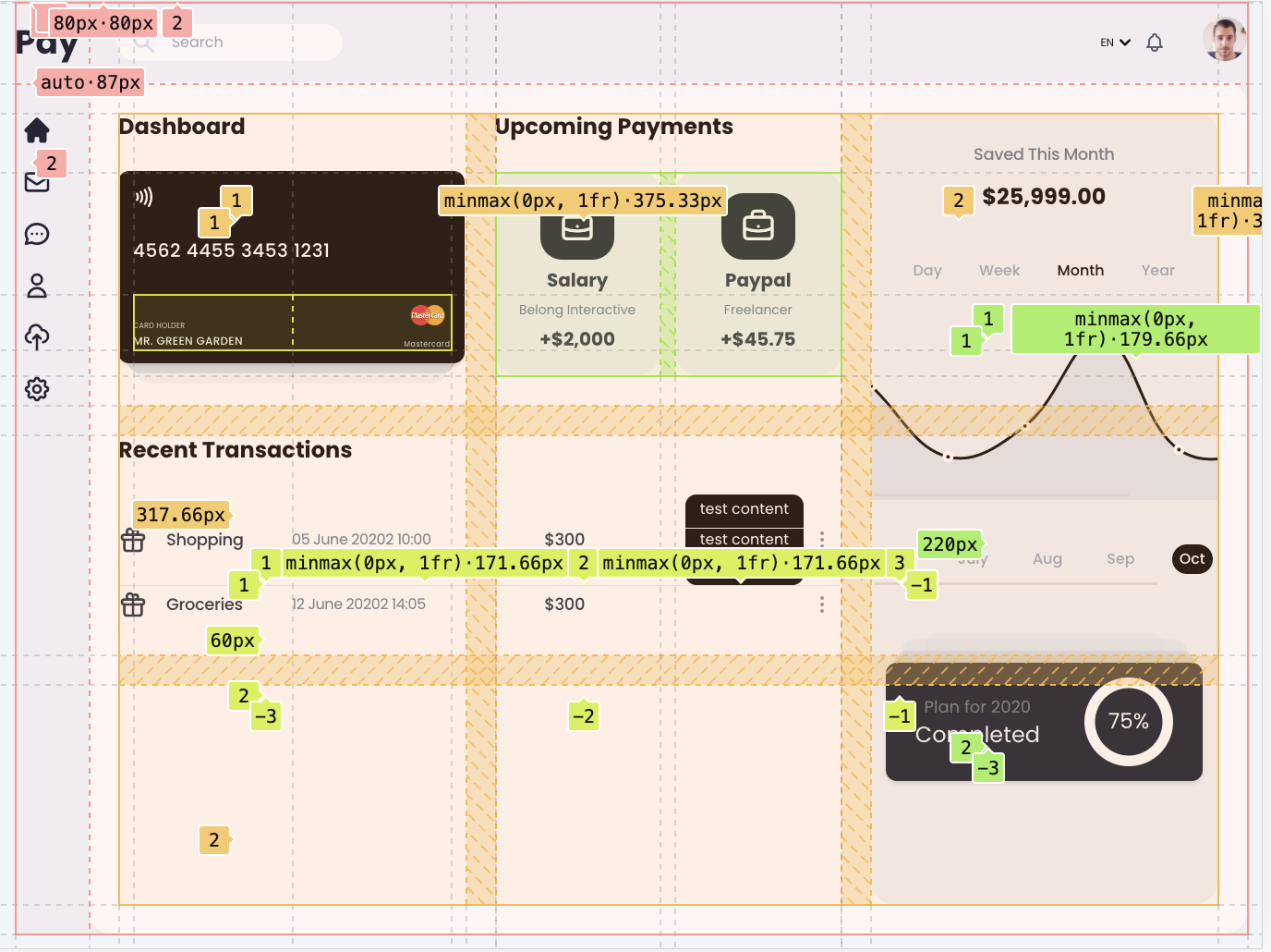
CSS Grid handles both the outer layout and the inner column structure of the dashboard area — cleaner than the nested flexbox approach I would have reached for before.
Chart.js
Minimal integration for the chart component. Enough to prove the layout works; I was more interested in the responsive grid and Tailwind 2.0 JIT than the data visualisation.
Find a design you like and just build it. It’s still one of the better ways to learn.